
Style Guide
Pops of color, pattern & texture
For the most part, solid neutral colors work best. But don’t shy away from adding pops of brighter colors, and remember, less is more in that situation.
Adding some texture can really help an image stand out. Consider incorporating lace, denim, or knit.
Try not to be too “matchy matchy”. We want your outfits to compliment one another but not necessarily match.
Layer and & accessorize
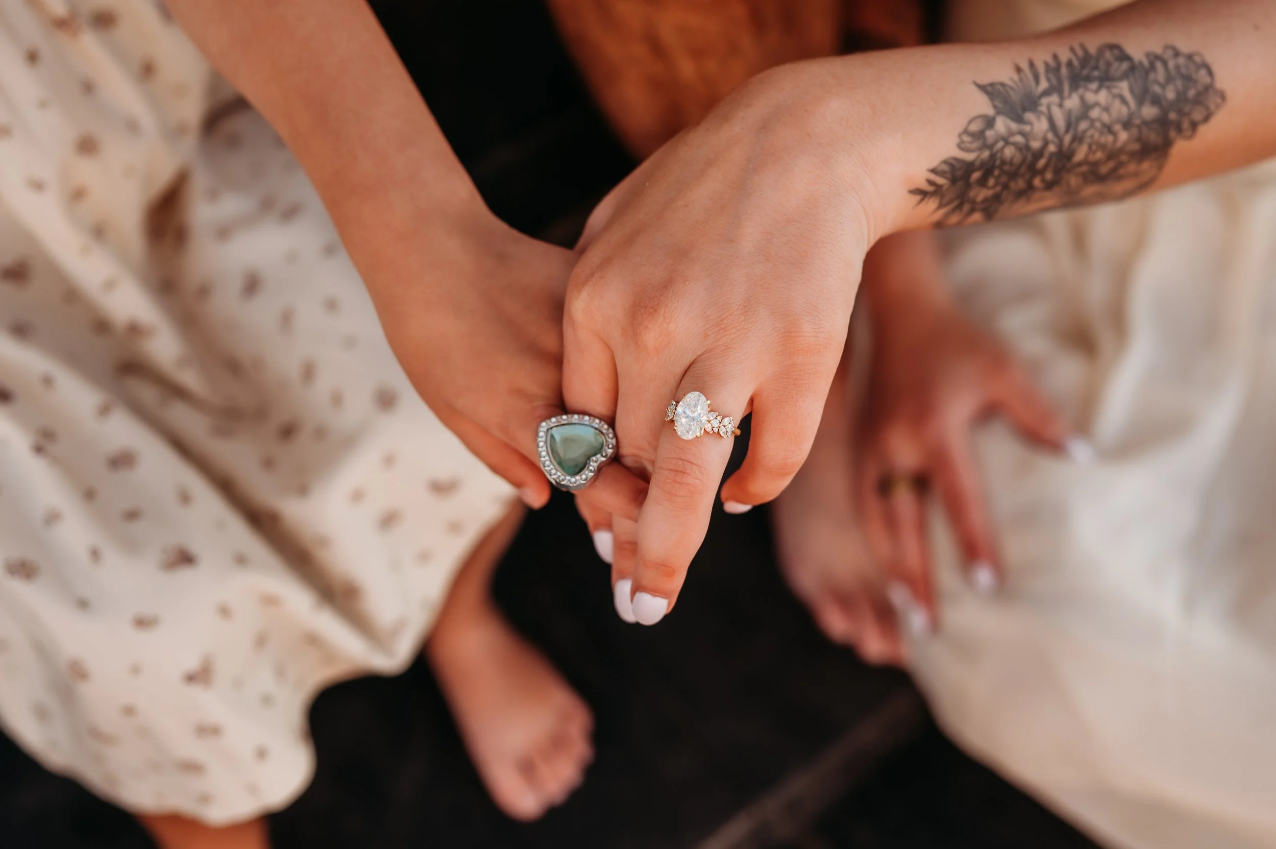
Belts, scarves, jewelry, jackets and hats can all be used to take your photo to the next level!
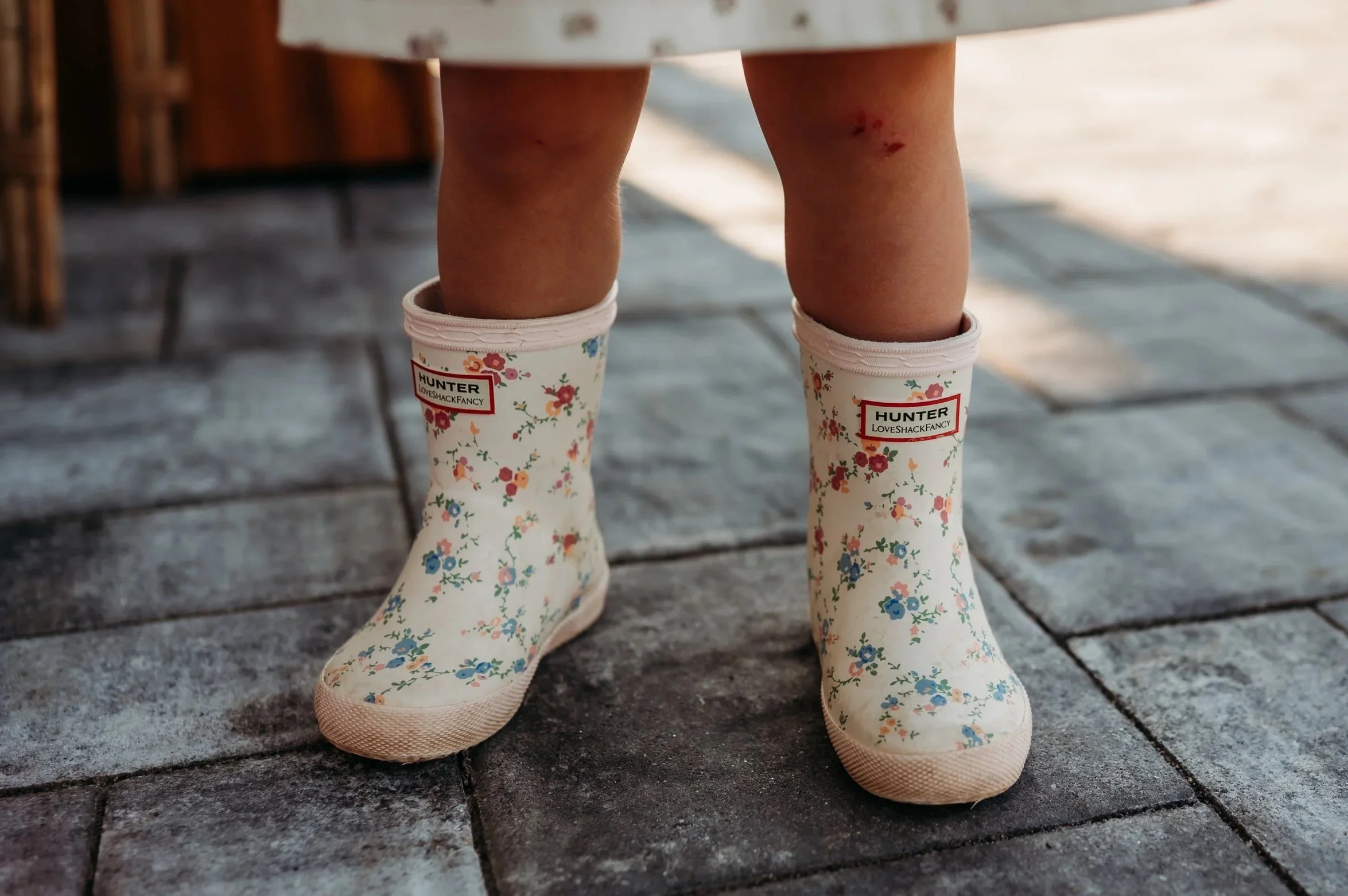
Don’t forget your shoes! Something that is often over looked is shoes! If you can’t find a shoe you like, consider going barefoot. Trust me, it can work!
Details Matter
Be sure that nails are clean and freshly painted if that’s your preference.
Don’t forget to remove rubber bands from your wrist before your shoot (I’m so guilty of this) they can leave indentations on your skin!
Phones and keys should also be taken out of pockets.
The Do’s
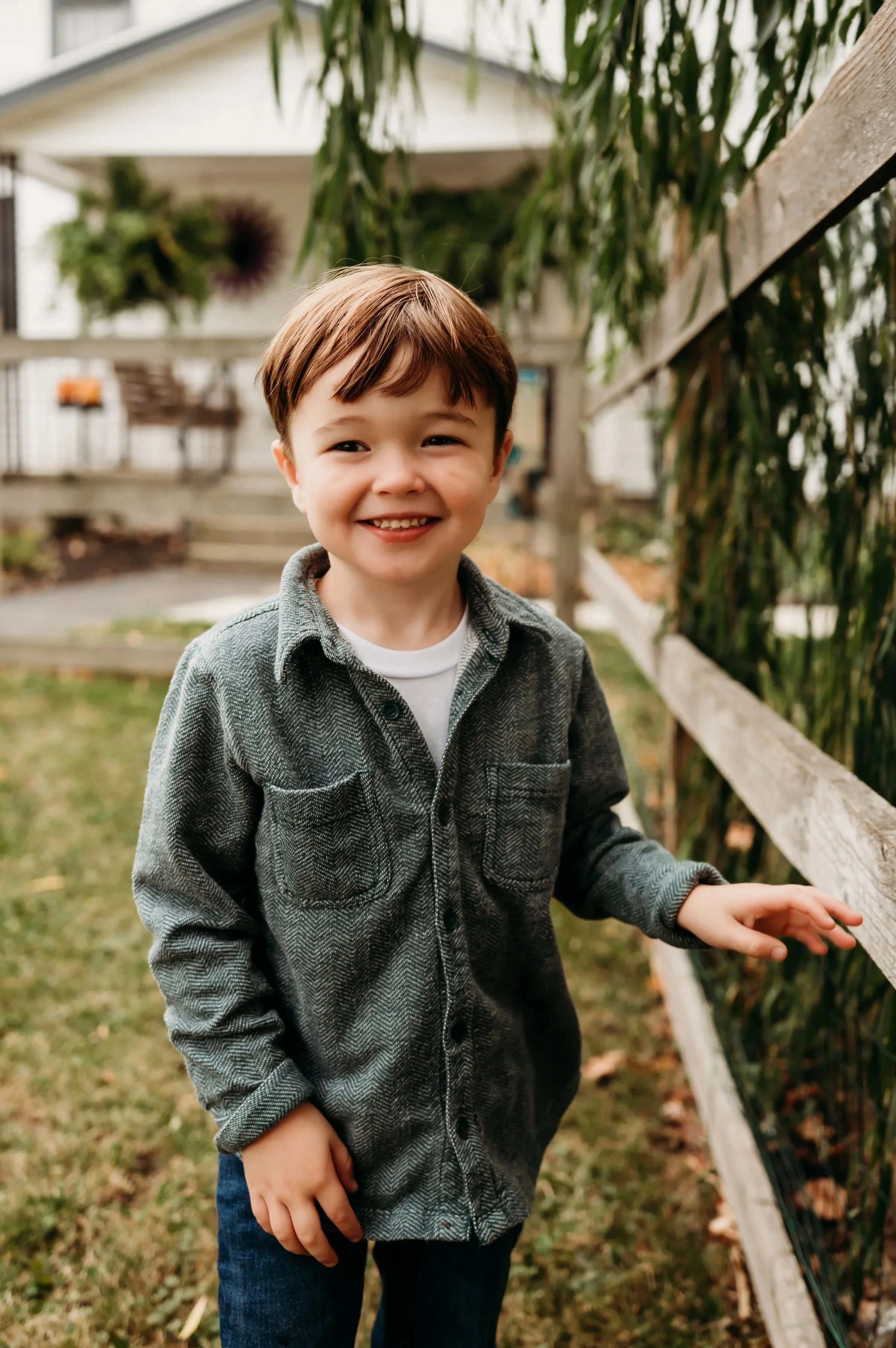
Nicely Fitting: Not too baggy, not too tight, easy to move in.
Statement Pieces: Patterns and bold colors are nothing to be afraid of, they can work great... in moderation.
Classics: Current trends can date your photos in the future, so choose something you think will stand the test of time.
The Dont’s
Bright colors: Neons and extremely saturated colors can make skin tones look strange. Try a muted version of the same color!
Logos, Text & Characters: Words and cartoon characters take away from the main focus of the photo - you!
Tiny stripes/patterns: They don’t translate well in camera, often causing what we call a moire pattern which makes it difficult to even look at.
Athletic Wear: They can just be too casual for family photos.